A snapshot
of America,
in 18 portraits
A snapshot
of America,
in 18 portraits
A snapshot
of America,
in 18 portraits
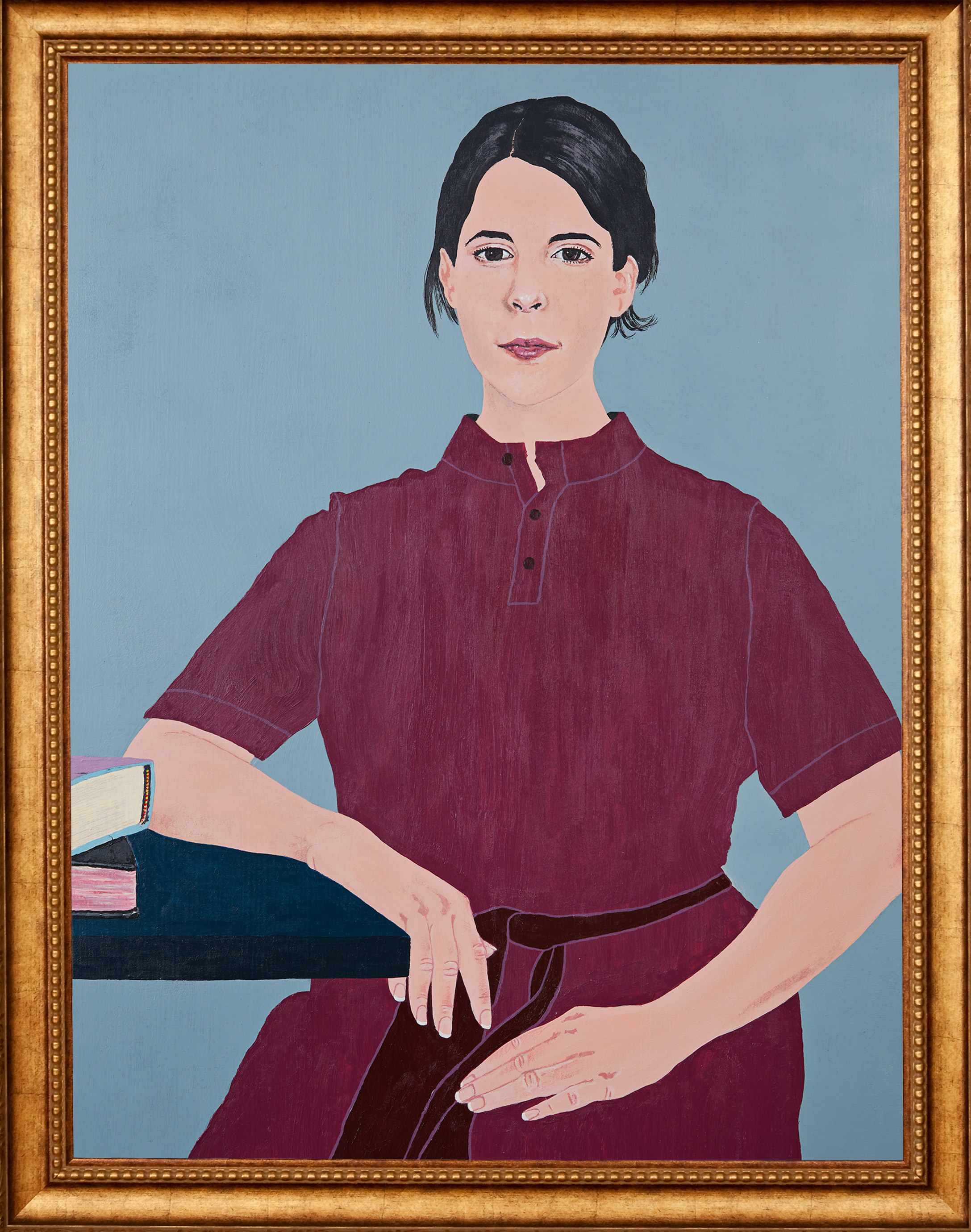
Assistant Professor Juliet Sperling, pictured here, began teaching art history at the University of Washington this fall. She took us on a tour of U.S. history by looking at 18 works of American art.
By Quinn Russell Brown | top image by Miha Sarani | December 2020
The first picture that students see in Juliet Sperling’s survey of American art is a familiar one: George Washington stands aboard a small boat as a group of colonists paddle him across the Delaware River. But this isn't the version from your high school history book: Samurai have tagged in for the colonists, and a new face has found its way atop the pyramid of patriots: Roger Shimomura, a third-generation Japanese American, stands in for the first president. He may not have beaten the British, but Shimomura has had more than 150 solo exhibitions since graduating from the University of Washington in 1961.
Shimomura Crossing the Delaware was painted in 2010 (you can see it by scrolling down on this list). The original, made by Emanuel Leutze nearly 70 years after the Revolutionary War, has also been remixed by artists like Jacob Lawrence (who taught at the UW for 15 years) and Robert Colescott (whose version is held by the Seattle Art Museum). It says a lot that Sperling would start an introductory survey class by exposing her students to a picture like this, one in which art is in conversation with art, racial and ethnic identity is foregrounded, and history is a moving target. Shimomura’s picture is quintessentially U.S.A. without chanting U-S-A!, and while it may delight the viewer at first, more than anything it sparks questions.
“I really care about how contemporary artists are remaking history and interrogating it,” says Sperling. “Shimomura is riffing on one of the most popular American paintings: As someone who doesn’t look like George Washington, and who hasn’t been represented the way George Washington has been throughout art history, he is inserting himself into one of the most ultra-nationalistic, ultra-patriotic artworks from American history.”
Shimomura, who joined the Army after earning his degree at the UW, was incarcerated in the Minidoka camp during World War II. His self-portrait as Washington inherits the paneled composition of a Japanese woodblock print. Shimomura Crossing the Delaware is one of 18 portraits Sperling chose for a virtual tour of American art history, which begins in 1671.
Sperling joined the faculty of the School of Art + Art History + Design this fall as Assistant Professor and Allan and Mary Kollar Endowed Chair in American Art History. For the top image, she chose to be depicted in a flat, sharp-edged folk art style, which was popular among traveling painters in America in the early to mid-1800s. This portrait was done in acrylics by Miha Sarani, ’15, ’19, who earned his B.F.A. in painting and drawing and his M.A. in art history from the University of Washington.
Juliet Sperling, as told to Quinn Russell Brown:
1671: Putting down roots with paint
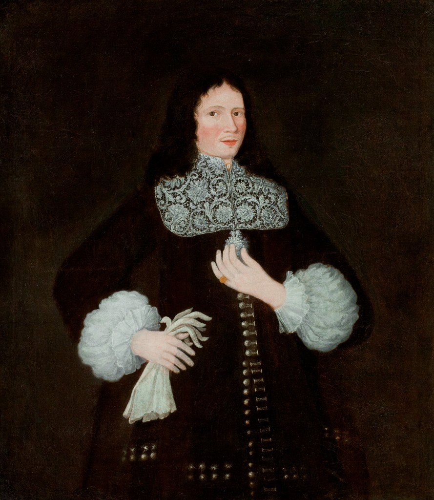
The Freake Portrait, artist unknown. Collection: Worcester Art Museum
There are so many ways to start a survey of American art. Why begin with portraiture? One reason is that it was one of the first kinds of art that became popular with settlers and colonizers from Europe. If you were a colonist in New England and it had been a hard journey, you didn’t have much. You were not going to spend your money on buying a painting instead of something utilitarian, like a cabinet. It tells us a lot about how portraits were perceived that they were the first foray into something that wasn’t furniture. They were seen as something that had a utility.
John Freake was a colonist in the Massachusetts Bay Colony. He was a wealthy merchant who was part of a Puritan class starting to think differently about status and material goods, and how to balance faith with ambition. We can see how he walks that fine line in this picture: the things he has decorating his body show that he’s both a devout Puritan (the plain coat) and a prosperous gentleman (the fancy lacework, the golden pinky ring).
One thing that will come up a lot in these portraits is that they had to be legible in their time. But so much of that is lost to us. Details that might read to us now as flamboyant, like long hair, signaled something completely different when they were made. Scholars have shown that his hair is purposely right in between the short Puritan style and the longer style of a liberated free thinker—it’s a balance.
What is a portrait supposed to be doing for you? The Freake portrait projected a public persona and documented a lineage in a new place where a family was starting from scratch.
1773: Shoring up social status
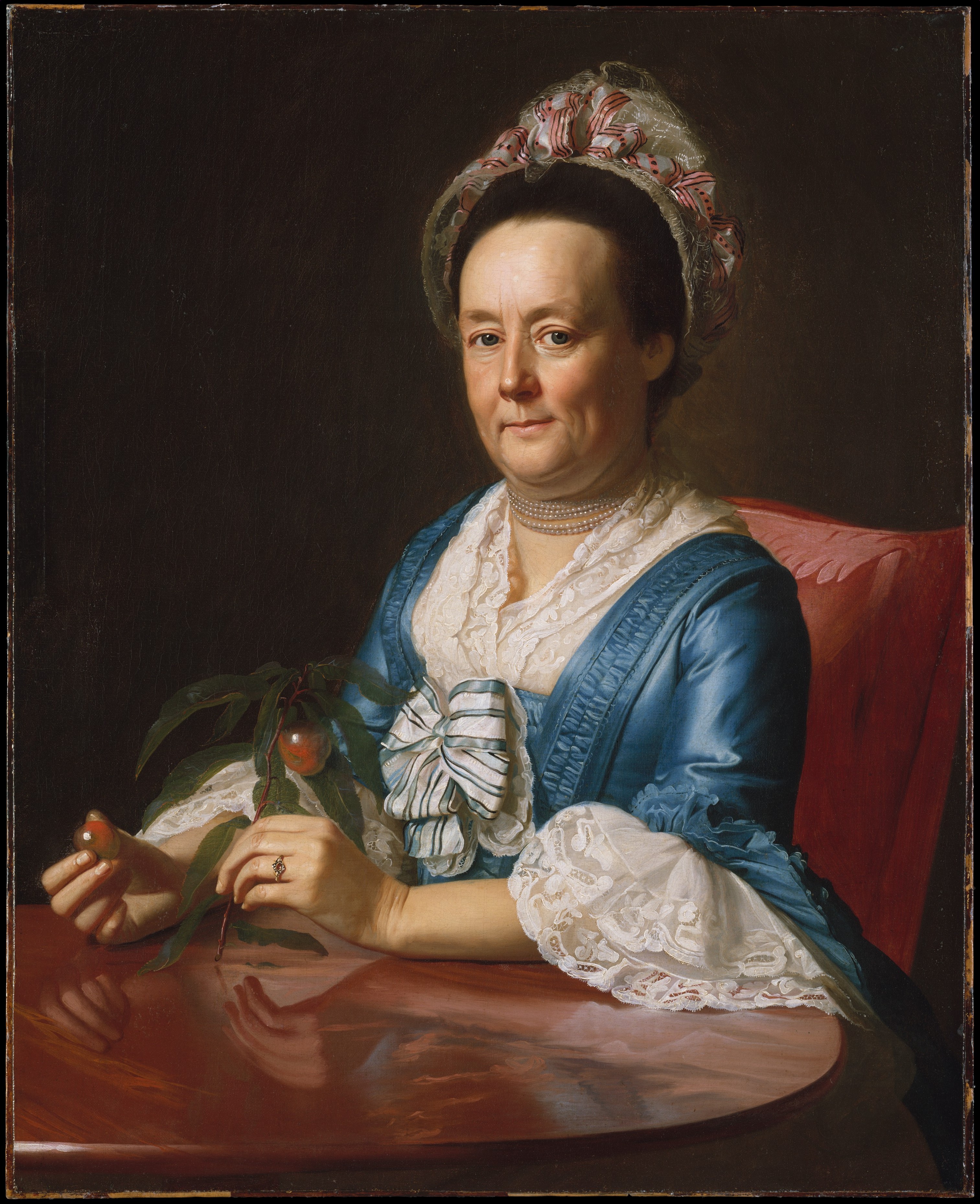
Mrs. John Winthrop by John Singleton Copley. Collection: Metropolitan Museum of Art
We’re in New England again, which was the focus of the colonial art world. Boston was the population center of colonial Anglo-European America, and anywhere you have wealthy colonists, you will probably have some kind of art production. Boston also had the most ties to the print trade back in Europe, and it was connected to places that valued portraiture, like England and France. There was art all over what we now know as the United States: art in Seattle made by Indigenous peoples, art in the South. Portraiture was just one possible way of communicating what a culture cared about.
John Singleton Copley was the most talented painter in New England during the 18th and early 19th centuries. He painted very well-known, historical figures—the 1 percent—and we remember some of these people today because Copley painted them. The portraits survived being passed down through generations.
By this time in 1773, portraits were even more powerful at shoring up identity and social status. Mrs. Winthrop was part of the Boston elite. She has fancy pearls grasping her neck, but the nectarine she’s holding actually tells you the most about her as a person: Copley has shown that the bottom of that stem is cut at a perfect diagonal. That means that Mrs. Winthrop is a grafter and knows horticulture, which was a point of moral pride. If you have the discipline and knowledge to grow nectarines in Boston, you can also cultivate good character in yourself or your children. Once again, you’ve got to know what’s important in the time the portrait is made.
There is so much to say about Copley and the American Revolution, but one tidbit that tells you what these portraits meant to people at the time: During the early days of the Revolution, some of Copley’s portraits were attacked. People stabbed them because whoever was depicted wasn’t on their side of the war.
1803: A self-portrait in silhouette
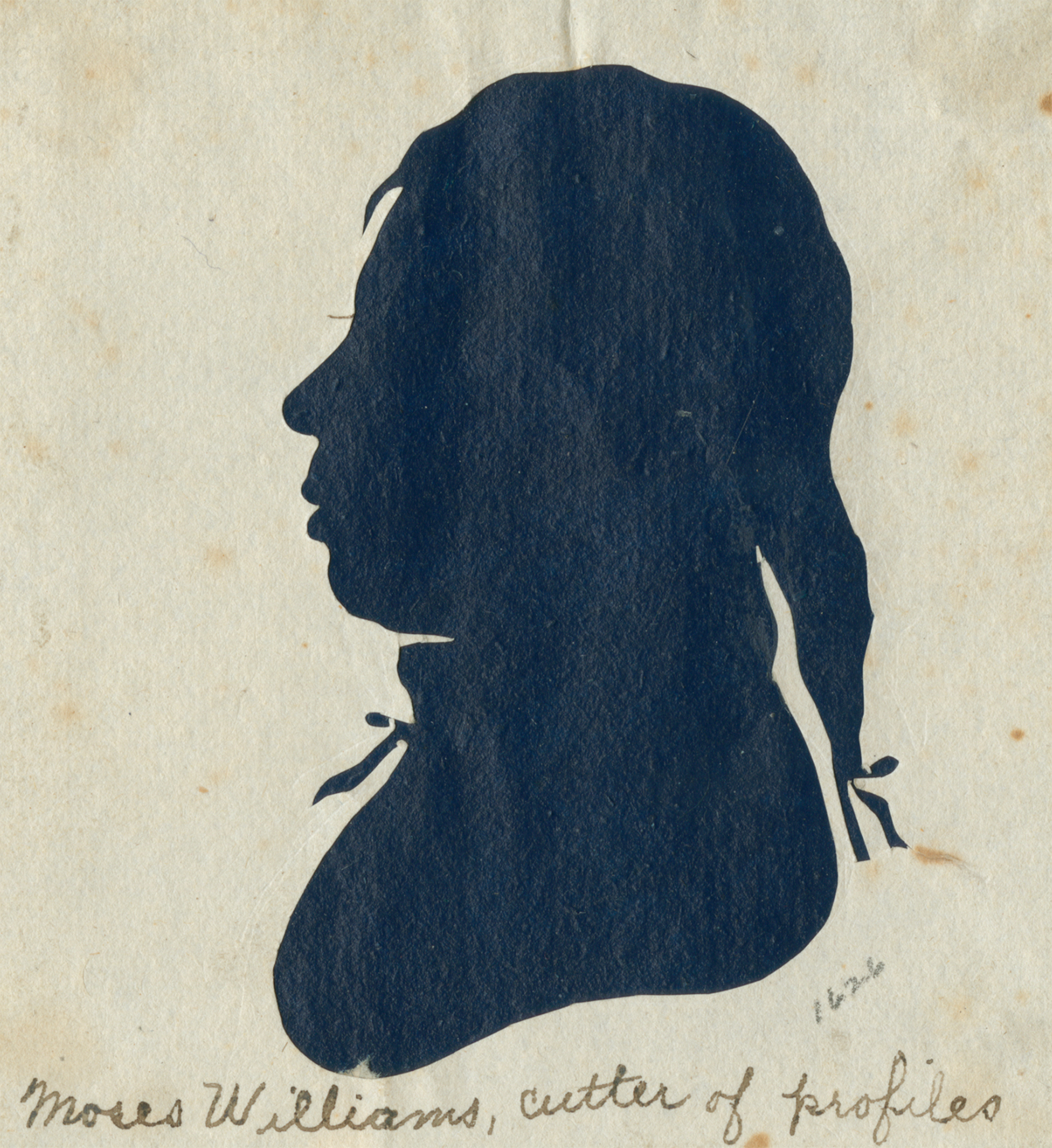
Moses Williams, cutter of profiles attributed to Moses Williams. Collection: Library Company of Philadelphia
This is so spare. Why is it an interesting portrait in American art? Partly because of who made it. For a long time, it was attributed to Raphaelle Peale, a son of Charles Willson Peale (see next portrait), but one of my mentors, the art historian Gwendolyn DuBois Shaw, has shown that this was probably made by Moses Williams.
Williams was born into slavery. He grew up with the children of the Peale family, but he wasn’t trained in painting like the other kids. He was employed in the family-owned museum, running the silhouette-cutting station. Imagine you’re sitting behind a sheet of paper and there’s a light source projected so that your shadow, in profile, is on the sheet. Williams used a machine that could trace the contours of the shadow and cut out a silhouette of your profile.
Moses Williams only had this machine that could render things flattened and in black-and-white. He didn’t have the palette and the paint brushes that the Peale children had. And yet, he used this to make a self-portrait, which is a testament to how much this mode of picturing people matters: You’re going to use what you have available.
Also, there is a significance here with the silhouette and slavery. There’s a history of silhouette cuttings of enslaved people being used like receipts of sale. Williams was able to buy some measure of financial independence due to his success at the museum, but he died mostly destitute. It was (and would continue to be) incredibly hard to be a mixed-race artist in Philadelphia, or anywhere in America.
1822: Marketing the young republic
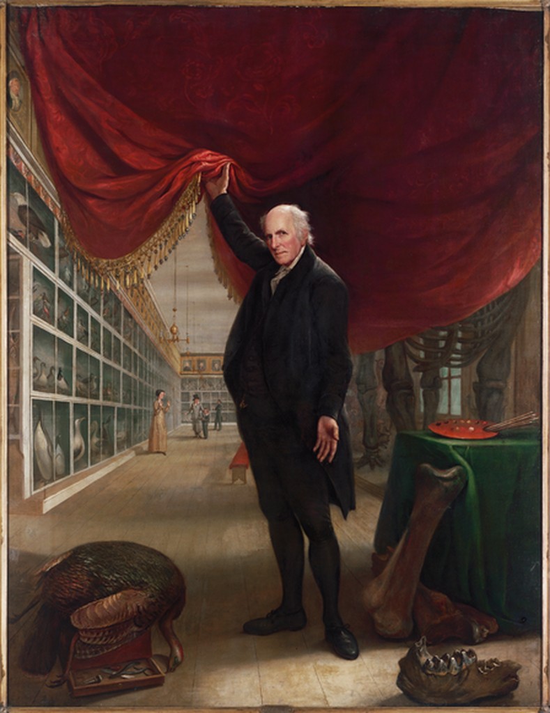
The Artist in his Museum by Charles Willson Peale. Collection: Pennsylvania Academy of Fine Arts
A portrait always has a job to do. It starts off in America as utilitarian, but that purpose morphs as we move through history. It changes depending on what the social world of the sitter looks like. The title of this painting tells you that this is a self-portrait. For Charles Willson Peale, it doesn’t just show his likeness or his social class: It shows his power as an artist, as a museum curator, as someone who is working to educate the nation. He wants to show you all these layers.
Peale was one of the founding fathers of American art. He started a museum that was one of the first places that Americans could go to to see objects and portraits that were meant to teach you about the world and history. The walls are all full of taxidermied animals. There are portraits of American presidents and leaders—portraits of men that Peale thinks viewers should emulate.
Peale is telling you what he thinks is authentically American. He believes there is a deep history here in the United States that is just as important as anything in Greece or Rome—it just looks different. Maybe not marble temples, but just as impressive. The job of the portrait is the same as his job as an artist: to unveil a history for America that is different from Europe.
1855: Reclaiming identity through imagery
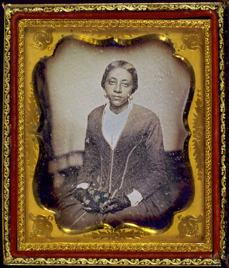
Unidentified woman holding daguerreotype case by Augustus Washington. Collection: Library of Congress
Augustus Washington was a Black photographer, one of the first successful portrait photographers. I like looking at his work because it reminds us that the reason we don’t encounter many early portraits of Black sitters is not because those images don’t exist: It’s because choices have been made about what images are put in textbooks and how history is told.
The daguerreotype was one of the earliest forms of photography and, until the mid 1850s, the most popular. Photography revolutionized how people made, saw, and interacted with pictures: Far more people could have a portrait made through photography than through painting. A daguerreotype was a one-of-a-kind image, like a painting, in that you can’t make copies of it. This one was enclosed in a gilded case with plush velvet inside. The luxurious materials tell you how treasured this genre was, and the type of social currency it held.
This is a picture within a picture. The woman is holding another daguerreotype. It makes us wonder, What are portraits supposed to do at this time? Create bonds between loved ones? What role do they play in forging relationships? Whose portrait is she holding, and what is her portrait supposed to do for somebody else?
Augustus Washington was depicting a newly emerging Black upper middle class. When this portrait was made in 1855, the nation was on the brink of a war over the ownership of human beings. Washington’s clients hired him so that they could claim ownership over their own self-images.
1877: An impression of womanhood
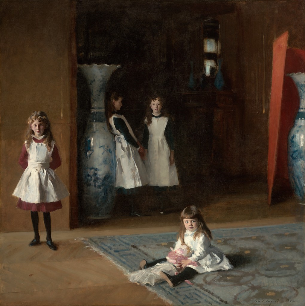
The Daughters of Edward Darley Boit by John Singer Sargent. Collection: Museum of Fine Arts, Boston
It’s hard to make a list of American portraiture without John Singer Sargent. That has to do with his adoption of Impressionistic techniques—a style that we are taught is sophisticated and important, because our view of art history is based on the Western European canon. This is why so much American art gets maligned: It’s seen as European art’s immature little brother. But that’s the wrong paradigm. American art is a tradition that is thinking about its specificity, its nationalism and its relationship to the rest of the world in a self-conscious way that European artists have never had to do.
Sargent was the most sought-after portrait painter of the late 19th century. One reason was his luscious treatment of paint and texture and fabric. Another reason is because he pushed the boundaries of what a portrait could be in a way that was intellectual and complex, and by proxy showed the patron’s sophistication.
The job of portraiture is really being stretched here. For one, Sargent is making it about himself and his skills as an artist, as somebody who can make something with an intense psychological depth to it. It also brings universal themes back into a genre that had become so personal and individualized.
This is a specific portrait of four daughters, but it’s also a general portrait of growth and womanhood. It’s about the weird, liminal space of when you’re not a child anymore and you’re becoming something more grown up. The composition leads the viewer into that hazy in-betweenness: The youngest daughter sits on the floor with her doll and stares out at us. The next daughter is standing up but still deferential to the viewer, with her little foot pointed out. As we get back into the dark, recessed space, these daughters are more distant from us. A claim often made about this painting is about the way the oldest daughter is leaning up against the vessel. Her body is going to become this container: She exists to bear a child and carry forth a family line. It’s individual but also universal, and I also think it’s pretty dark, too.
1897: A pioneering artist paints his mother
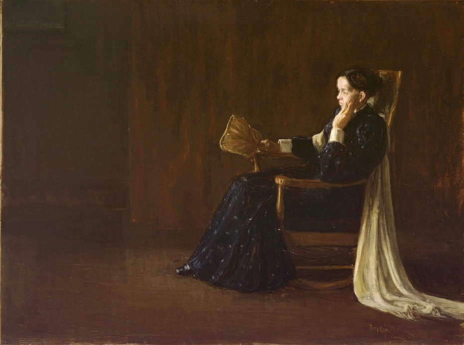
Portrait of the Artist’s Mother by Henry Ossawa Tanner. Collection: Philadelphia Museum of Art
Tanner was the most celebrated professional African American artist of the 19th century. He was exceptional because of the way the academic system was set up in the United States. As you might expect, it excluded most people who looked a certain way or were a certain class. When he studied at the Pennsylvania Academy of Fine Arts, he was the only student of color.
This painting echoes the struggle of his entire career: How could he get people to see him as an American artist—period—and not as an African American artist? He started off painting genre scenes of everyday life as lived by Black Americans, and he left that behind because he became pigeonholed as a painter of Blackness.
This portrait of his mother riffs on one of the best known paintings of this moment by James Abbott McNeil Whistler, a white artist who is thought of as an American artist, even though he spent only around a decade in the United States. There’s an irony in Tanner appropriating that composition, as someone who is really struggling to be seen as just an artist, period.
Tanner puts himself in conversation with Whistler, this quirky and flamboyant personality who had controversial ideas of what art should and shouldn’t be. But Tanner is a quiet, inward-looking man. And you can tell in the way he pictures his mother. She is not just an element in the composition, like Whistler made his mother in Arrangement in Grey and Black no. 1. Tanner’s mother has emotion on her face, and the way that she is leaning is individualized. Her body is responding to somebody else being in this space with her.
Tanner had moved to Paris because the racism he faced in America was unbearable. This was made during a brief visit home to Philadelphia, which is why it also might be hard to view his mother as an impersonal compositional element. He hadn’t seen her in years.
1927: A towering presence
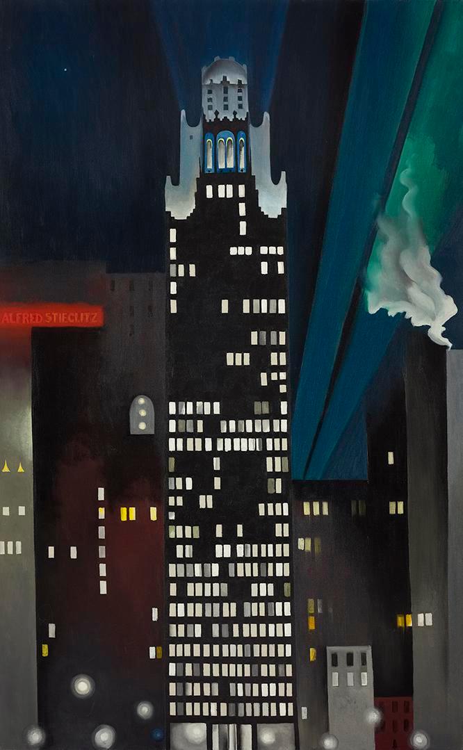
Radiator Building—Night, New York by Georgia O’Keeffe. Collection: Crystal Bridges Museum of American Art
How many female artists can you name? Georgia O’Keeffe is probably on that list. She’s one of the best-known artists of the 20th century, in part because of how she navigated a male-dominated art world. This is a portrait of Alfred Stieglitz, a powerful figure in the New York City art scene, and O’Keeffe’s husband.
How do you create a portrait of someone that doesn’t show their face? A lot of the artists on this list have been working toward this. Artists have always tried to fragment a sitter’s personality into things that aren’t just their body. They surround them with things and have them hold onto objects: their pearls, their nectarines, their daguerreotype cases. Emblems and objects have always indicated identity in portraits.
O’Keefe has eliminated the face and identified the person with only the surroundings. We don’t even need the body. Alfred Stieglitz’s name blazes in red at the left. He is akin to a skyscraper, a towering presence in New York City. O’Keefe has put his name in lights, and he is bringing light to Manhattan. That is his mission as a person: to illuminate America with art.
Look at the gap in the years here: We just moved from 1897 to 1927. A lot of big things happened in that time, like the emergence of Modernism. In the period between the world wars, painting and art started to look nothing like what we’ve seen so far. With the Freake and Copley portraits (#1 and #2 in this list), likeness was a naturalistic representation of somebody’s face that could be tied to showing a lineage through portraiture. That importance falls away over time: We don’t need portraits to show whose bloodline we came from anymore.
1939: Making myths with a wink and a nod
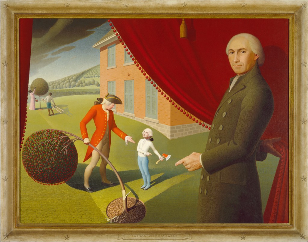
Parson Weems’ Fable by Grant Wood. Collection: Amon Carter
Like Charles Willson Peale (#4 on this list), we have a man pulling back a curtain. He reveals a familiar tale: We tell our kids that our first president, George Washington, got caught chopping down a cherry tree and says, “I cannot tell a lie.” It’s a fable, probably not true, told by Parson Weems, George Washington’s first biographer. Weems is the one pulling back the curtain in this painting.
This picture is a story within a story. Grant Wood, best known for American Gothic (1930), made art that created fantasies for the nation to believe in. And here, the myth maker artist has painted the myth maker Weems, who is showing us his myth, his story. It’s done in a deliberately naive, self-taught style, flat and simplified. The landscape is toylike, almost like we’re looking at a dollhouse or a diorama.
This was 1939. Hitler had just invaded Poland, the opening act of World War II. Wood is trying to create stories for America at a time when he knows we need something to believe in. The result is a portrait of George Washington in more senses than one. It’s biting, funny and self-conscious. He wants to let you know that what you are believing in is really a fantasy. He gives the kid a grown-up face, the famous Gilbert Stuart unfinished portrait that you know from the one-dollar bill.
Obviously this is not what George Washington looked like as a little boy. It’s a sly nod to the way that images and stories can take over our memory of a person. It’s about how this artist had the power to create a vision of a person, of a history, that has supplanted all of the other versions of that person and that history. Artistic representations have the power to shape and to erase memory. We only know the Washington that has been constructed for us.
Not to be ignored, there are two people with skin that is darker than Washington’s. These are people who have been enslaved, and Wood is gesturing to the gap between myth and social reality in the national imagination—this dissonance between the stories we want to tell ourselves about how America was constructed, and the actual way it was constructed. It’s a reference to how history is selective, and how you’re not always going to see everything. I think the point he is making is that this story is being equally sanitized.
Still, Wood believes that even though representation is always invented, always constructed by some myth maker, a nation needs those unifying myths in order to keep going, in order to believe that it has a purpose. As much as he’s pointing out the problems in making myths, he’s reminding you that he thinks they need to be made.
1942: A new American icon
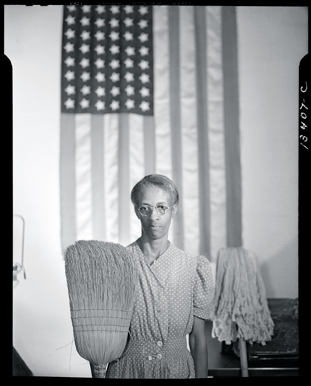
Government charwoman, Washington, D.C. (Ella Watson) by Gordon Parks. Collection: Library of Congress, Prints & Photographs Division, FSA/OWI Collection
Gordon Parks was the only Black photographer employed by the federal government during the New Deal. This is one of the first pictures that he made when he showed up for work at the Farm Security Administration. He was really fired up and wanted to capture the racism he was experiencing in D.C. His boss, Roy Stryker, suggested he take a human angle and get to know the janitor in their building, Ella Watson.
Parks is remaking the portrait of American Gothic, which we referenced in the previous picture. He and Watson had conversations about her American life. Her father had been lynched, her husband had been shot, and her daughter died in childbirth. And here Watson is, working hard in this building and keeping the American government clean. She is holding a mop and a broom in front of a flag, and Parks is drawing a parallel between the icon of everyday American life—the salt-of-the-earth farmer and his daughter—and somebody who isn’t usually put in that iconic position. He’s making sure that nobody misses the point that he’s making: that her American story is one that we’re not used to seeing in the spotlight.
Parks later called the photograph “unsubtle.” His other images of Watson are much more individualized and much less allegorical.
1961: Piecing a family back together
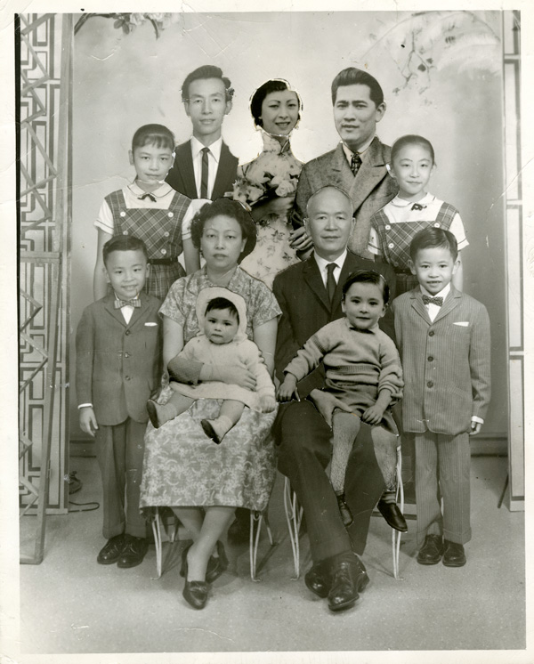
Low Family Portrait, unidentified photographer. Collection: Museum of Chinese in America
This isn’t just a single photograph: It’s a collaged photograph of a family, with some faces cut-and-pasted in. It’s a family that has been separated by immigration laws. Mr. and Mrs. Low had immigrated to the U.S. from China, but their daughter Moo Gee and her family were denied entry. Exclusion laws kept them half a world apart. Whoever collaged this photograph used the material of portraits to tangibly bring the family back together again, even though they couldn’t be together in real life.
The use of the term “portrait” here is important. It’s not in the sense of an individual, as we’ve seen in every image so far. It’s a representation of a family as a collective entity: a group with a core set of values, who care about and believe in the same things.
Images do real emotional work for people. This family cut up pictures and imagined putting a bond back together with the pieces. Twenty years later, they were finally reunited.
1973: Looking for home in a new land

Untitled, from Siluetas series by Ana Mendieta. Collection: Museum of Contemporary Art
I put Ana Mendieta on this list for a number of reasons. She helps us think about the question: Who counts as an American artist? Does your birth certificate play a role in whether or not you’re counted in this group? Mendieta was born in Cuba. Her family was exiled when she was 12, only old enough to have fuzzy memories of home, and she moved to Iowa.
She made this series as an art student in the mid-’70s. She went to Mexico, a place that felt more like home than Iowa ever did, to work through ideas of displacement and homeland. This was at the same time as the land art movement, where all of these men were making giant interventions in the earth with bulldozers and dynamite. Mendieta does something different with the land. She burrows her body in it, digging herself into the dirt and then takes pictures as the earth and the elements wash the indentation away. It’s not quite a performance, but the photograph is only a partial document of what she was trying to get across.
I don’t think Mendieta would have used the word “portrait,” but to me her siluetas are a perfect example of the genre: an artist working through questions of who she is, where she belongs, and who she belongs with. And her face doesn’t have anything to do with that.
1977: An artist in two places at once
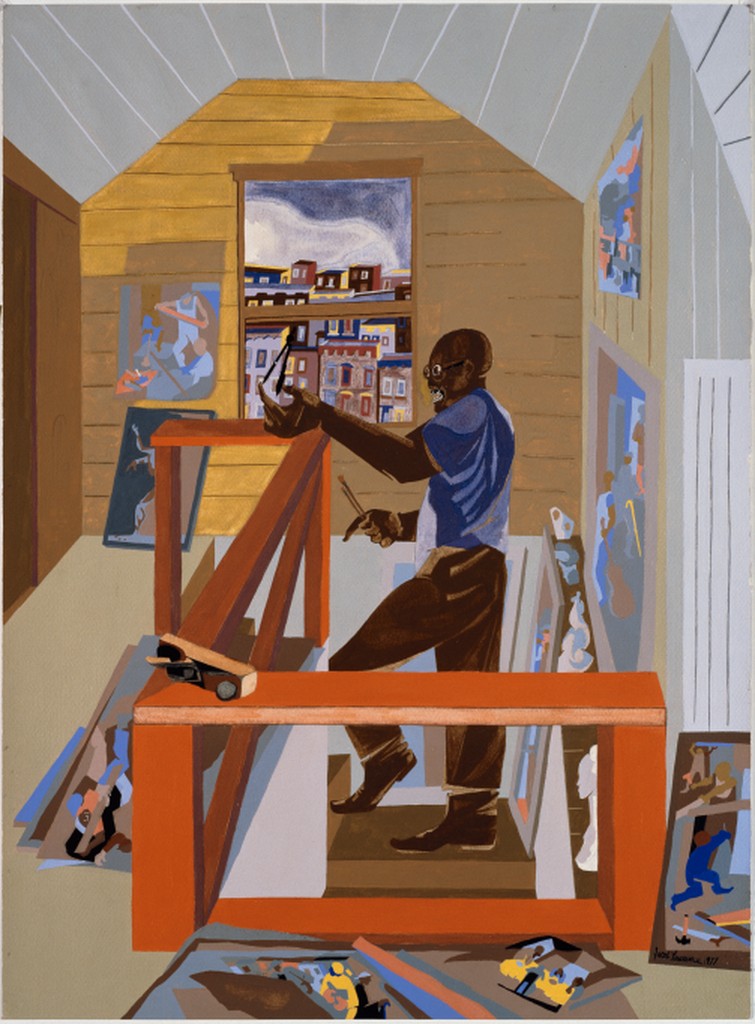
The Studio by Jacob Lawrence. Collection: Seattle Art Museum
Jacob Lawrence was a professor in the UW School of Art + Art History + Design for 15 years. Before he came to Seattle, he was one of the best-known American artists working in New York. He got his start in the Harlem Renaissance, painting Modernist, geometric scenes of Harlem and New York City. He’s always been known as one of the greatest African American painters, but it was important to him that he was painting America in general. He wanted to paint an image of the nation that was truly inclusive.
A major part of his identity was as an educator. He told multi-panel stories in his work, such as the Migration Series (1940-41). In his American Struggle series, which is coming to the Seattle Art Museum in March, he painted familiar scenes of American history from unfamiliar perspectives. They disorient us and ask us to look at the past with fresh eyes.
In this self-portrait, we’re in his Seattle studio, but we see Harlem out of the window. We know it’s Harlem because it resembles one of his famous paintings, This is Harlem (1943). That linkage of two places is how he is telling us about who he is as a person.
1991: The sweetness of love, and loss
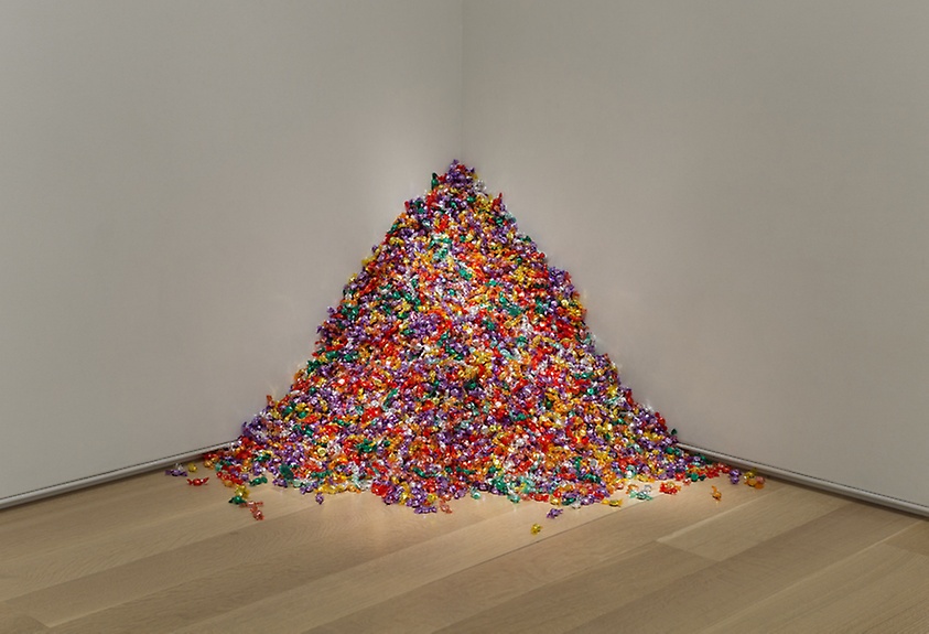
Untitled (Portrait of Ross in L.A.) by Félix González-Torres. Collection: Art Institute of Chicago
In the title, Félix González-Torres is telling you this is a portrait of a particular person, time, and place. That’s Los Angeles in 1991, right in the thick of the AIDS crisis. González-Torres was a queer artist whose partner, Ross Laycock, was dying of AIDS. This installation is in museums across the country. The portrait is a pile of individually wrapped candies, and the most important thing about the work’s material is that the ideal weight is 175 pounds. The viewer is invited to walk up, take a piece of candy and eat it. But what you’re doing as you take that candy is reducing the weight of the pile.
González-Torres was thinking about his partner wasting away, and becoming smaller and smaller before he dies. But this is a work of art that constantly gets replenished. There is a constant presence of Ross in these museums, always at the ideal weight before he declines. It matters that they’re candy: You’re experiencing a bit of sweetness, of love.
This is different from the other non-likeness portraits on this list in that it’s not even about the emblems anymore. The candy is an abstracted quality—it’s sweet, and this is a person that the artist loved—but there is not a direct connection to Ross. Maybe what González-Torres is doing here is saying that the portrait doesn’t have to be for the public anymore: It can be a personal, interior memory for the artist and the sitter. The viewer gets to experience some of that, but we might not get to know Ross the way we would through another kind of portrait.
2010: A new face for a Founding Father
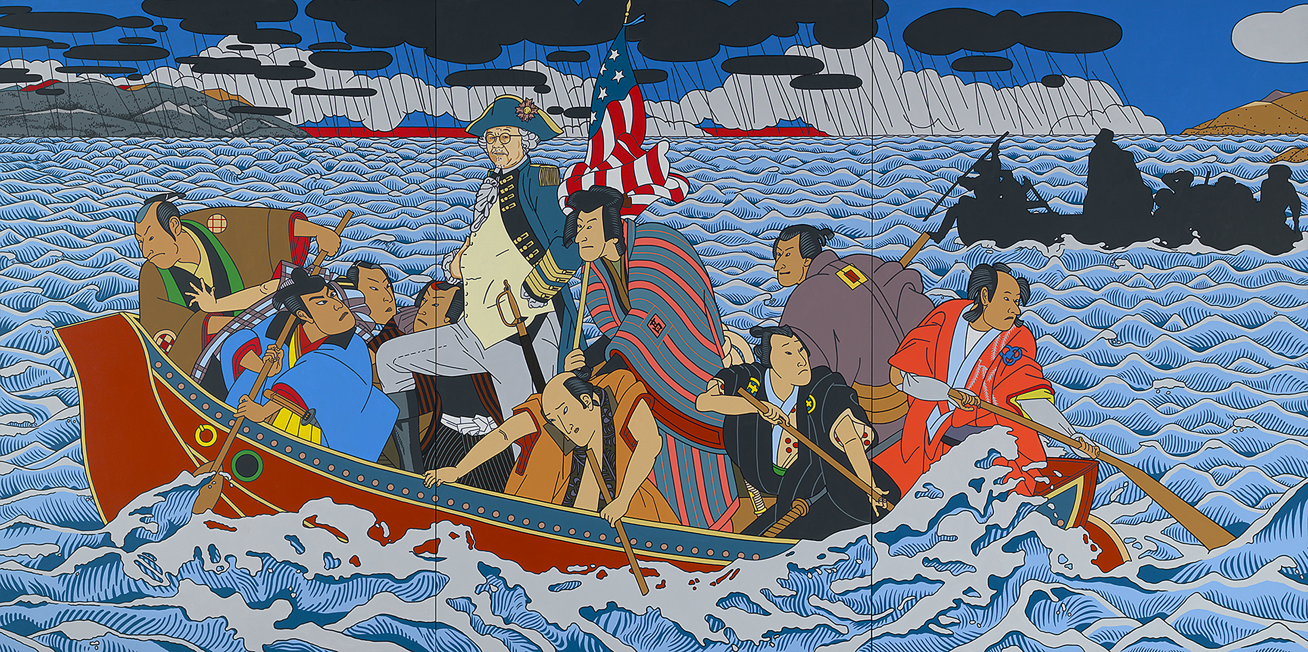
Shimomura Crossing the Delaware, © Roger Shimomura. Collection: National Portrait Gallery
Seattle-based artist Roger Shimomura has strong ties to the University of Washington. In this painting, he is riffing on one of the most popular American paintings. The original Washington Crossing was created by an immigrant, which may be surprising to most audiences today. Emanuel Leutze was German, and I don’t think that was lost on Shimomura as he asks us to question who America really belongs to.
In the title, Shimomura says he is crossing the Delaware, like Washington, but he is actually in the San Francisco Bay. Immigrants from Europe typically came through Ellis Island, while immigrants from Asia came through Angel Island. So this is a different kind of crossing, and just by doing that, Shimomura is asking who gets counted as American and what a portrait of American identity looks like.
We’re seeing a mixture of 19th-century American visual language and the style of Japanese woodblock prints. He’s evoking Hokusai’s Great Wave (1820-1831) with the way the water is represented. This is something that Shimomura does a lot in his art: He uses traditional Japanese art styles to remake traditional American stories and have you, the viewer, challenge what you assume our shared reference points should be.
2017: Humanizing the historical record
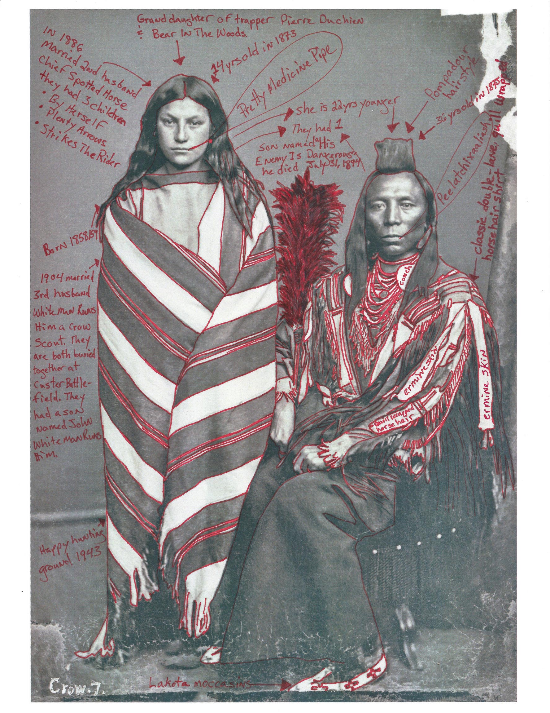
Portrait of Perits-Har-Sts (Old Crow) With His Wife, Ish-Ip-Chi-Wak-Pa-I-Chis (Good or Pretty Medicine Pipe)–1873 Peace Delegation Series, © Wendy Red Star
Wendy Red Star’s portrait builds on images made by a photographer named Charles Bell, who took pictures of Native Americans for the American government in the late 1800s. The idea was to document them before Western civilization would push them out. Obviously this didn’t happen, as Wendy Red Star tells us through the way she intervenes with this historic photograph.
Red Star takes historic pictures as a starting point, and wrests them back from their original uses in powerful and complex ways. This picture is part of a larger Crow Peace Delegation series in which Red Star, who is a member of the Apsáalooke (Crow) tribe, draws upon her cultural heritage to restore individuality to the subjects. She has used red pen to annotate it, telling us who we are looking at, what they are wearing, and what it can tell us about the history they came from. Sometimes she even writes things like, “This is my friend’s great uncle,” to draw attention to the present. To say that these are people who have family members who live around you today.
She’s enlivening these pictures, which existed to justify extinguishing people, and she’s bringing them back to life through teaching us about who and what we’re looking at. By drawing attention to what was missing in the original photograph, and by showing what is needed to do service to a person, she is laying bare for us what the mechanism of a portrait is. We could think of this as a definition of portraiture in action.
2017: Reprinting the front page
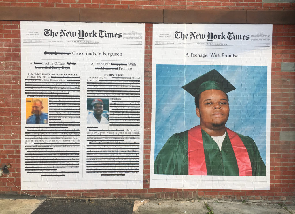
A Teenager with Promise, © Alexandra Bell
This is another example of the fuzzy boundaries between portraiture, a genre that constructs a desired identity, and non-portraiture. Sometimes pictures actually do damage, do violence to the people they depict. That’s what this work is about.
These are wheatpaste installations that were put up around New York City around the time of Michael Brown’s killing in Ferguson, Missouri. Contemporary artist Alexandra Bell has reimagined what the front page of The New York Times on that day could look like. On the left side, she has cut out everything except the words “Officer Darren Wilson fatally shot an unarmed teenager named Michael Brown.” She removed anything about who Darren Wilson is as a person, anything that brings humanity to a police officer who killed a man. She cuts out all of the ways that Michael Brown, the victim, is equated with his killer. And on the right, she has given us an alternative front page that is a portrait of Michael Brown. This is a portrait of Brown as he should have been commemorated. A high school graduate looking out to the future. “A Teenager with Promise.” What if this was our narrative? Bell is using portraiture as a vehicle to make this argument.
2018: A portrait you can meet
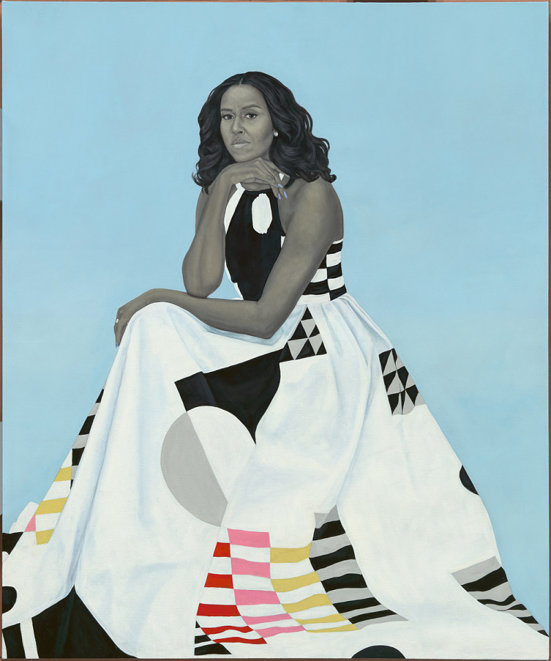
Former First Lady, Michelle Obama by Amy Sherald. Collection: National Portrait Gallery
I felt in my gut that this is where we needed to end this story of portraiture, and now that I’m looking at it, it really is a perfect callback to where we started. The way Amy Sherald has posed her sitter, First Lady Michelle Obama, takes us back to the look of traditional portraiture: a face in three-quarters profile. It’s painted, and painting is where portraiture starts and ends on this list. We know from interviews that this is how Michelle Obama wanted to be portrayed. They chose the dress and the color palette together. This is a perfect collaboration between the artist and the sitter.
This portrait, and Kehinde Wiley’s portrait President Barack Obama (2018), remind us that portraiture is very much a living art that people care about. People stand in line to see them at the National Portrait Gallery, waiting to have a moment of communion with a person that they are probably never going to meet, but that they feel like they will be able to meet in a way through this vector—this shadow of the self. If a portrait was powerful enough for a Revolutionary to stab it in the face (#2 on this list), the fact that we take a selfie with Michelle Obama tells us that these things still have a similar humanity for us. They are surrogates for people. Even though we can’t be in the same room with someone, a portrait can carry their presence.
This tour through American portraiture builds on research and writing by a large community of scholars, teachers and curators of American art. Want to learn more? Sperling recommends the following books and articles for a deeper look into select portraits on this list.
- Paul Staiti explores character and class in Copley’s portraits of the colonial elite and Lauren Lessing uncovers the violent scars hidden in colonial-era canvases (“Shoring up social status” on this list)
- Gwendolyn DuBois Shaw shines light on the work of Moses Williams and Augustus Washington (“A self-portrait in silhouette” and “Reclaiming identity through imagery”)
- Michael Lobel shares the collaboration between Gordon Parks and Ella Watson (“A new American icon”)
- Wendy Red Star and Shannon Vittoria untangle the meaning of delegation photography, then and now (“Humanizing the historical record”)
 Juliet Sperling is an Assistant Professor of Art History and Allan and Mary Kollar Endowed Chair in American Art History in the School of Art + Art History + Design, where she researches and teaches about American art from the colonial era to the present. While completing her Ph.D. at the University of Pennsylvania, she held fellowships at the Metropolitan Museum of Art and Smithsonian American Art Museum. Before coming to the UW this fall, she taught American art history at Colby College. She was interviewed and photographed by Quinn Russell Brown and painted by Miha Sarani.