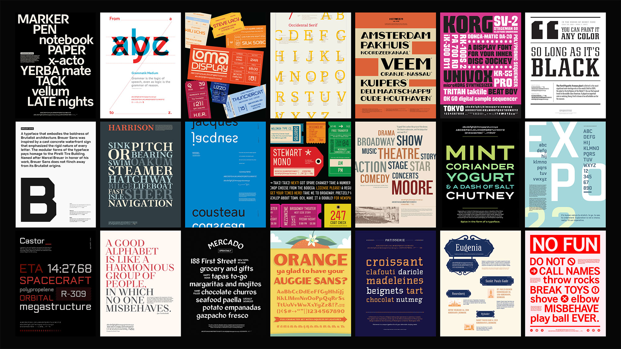
Most people regard words only for their meanings, instead of appreciating how they’re designed or visually styled. But a memorable typeface conveys personality, formality and even beauty. The New York Times won’t use a comic sans typeface to lay out a news story, because that casual script communicates an unauthoritative appearance which readers would find incongruent.

UW Design Professor Karen Cheng. Photo by Paul Kooiman.
“It can be beautiful when a typeface works well and people don’t see it,” says Karen Cheng, professor and chair of the Visual Communication Design major at the UW School of Art + Art History + Design. “Typeface is a fashion element. Words can be skeletons that you dress up in different clothing, like an enduring little black dress.”
Cheng is the author of “Designing Type” (Yale University Press, 2020), a comprehensive guide that’s now in its second edition on the process of creating and designing type. Her textbook covers the anatomy of letterforms and how to design a typeface, while also touching upon the history of type, the primary systems of typeface classification, the parts of a letter and the effects of new technology on design methodology.
“Typeface is a fashion element. Words can be skeletons that you dress up in different clothing, like an enduring little black dress.”
UW Design Professor Karen Cheng
Though Cheng wrote what’s considered to be one of the top 50 typography books of the past 50 years, she became a designer later in her professional career. Her Taiwanese parents wanted her to go into medicine or industrial science. So, Cheng studied chemical engineering, even though she wanted to do something visually oriented. She worked for Proctor & Gamble as a chemical engineer before shifting to its brand management team, where she worked with colleagues who had advertising backgrounds. That experience sparked a deeper interest in changing careers and studying design. While pursuing a graduate degree in design from the University of Cincinnati, Cheng found herself drawn to type as a graphic language.
“It’s one of the few things that we interact with every day,” Cheng says. “It’s microscopic. Until you design type – you take it for granted. But once kids learn about type in signs and logos on cars, a whole invisible world becomes visible. Suddenly you’re just aware of decisions people make when they put type on packages, signs and newspapers. There are no bad typefaces. There are flavors that are weird together, but it’s like putting together bacon and chocolate. Someone probably likes it.”
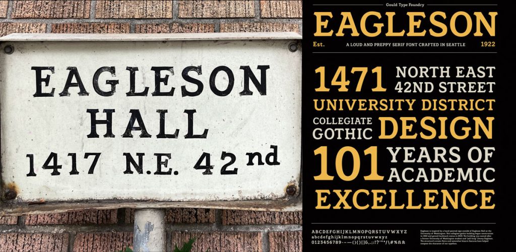
Students in Cheng’s class take inspiration from hand-painted signs—like the one on 101-year-old Eagleson Hall—to create a full typeface.
As part of the undergraduate design curriculum, students are required in the Visual Communication Design major to design a typeface in Cheng’s class. Not everyone appreciates the tedium required in creating a new typeface. It’s a highly disciplined, and almost-scientific exercise in shape-making that hews to a process. In a basic font, there are 300 characters: Lower-and upper-case letters, numbers, symbols and diacritical marks, in addition to the ampersand and numerical symbols. Small errors are devastating. But just like poetry, where every word bears the weight of a sound or connotation versus its wordy prosaic counterpart, type design is a bit more microscopic.
Several of Cheng’s former students, like Burke Smithers, ’24, and Peyton Todd, ’23, have continued their studies at design intensives like Type@Cooper in New York. Rising senior Sofia Rossi is currently attending TypeParis, where Yusuke Ito, ’05, Dustin Mattaio Mara, ’22 and Koko Morrill, ’20, studied after graduating from the UW. Several alumni have designed their own typefaces, like Smithers, who created his Phylum typeface based on old-growth forests in the Pacific Northwest, and Christine Ngo, ’14, who invented Caphe Grotesk, a script inspired by Vietnamese American cafes.
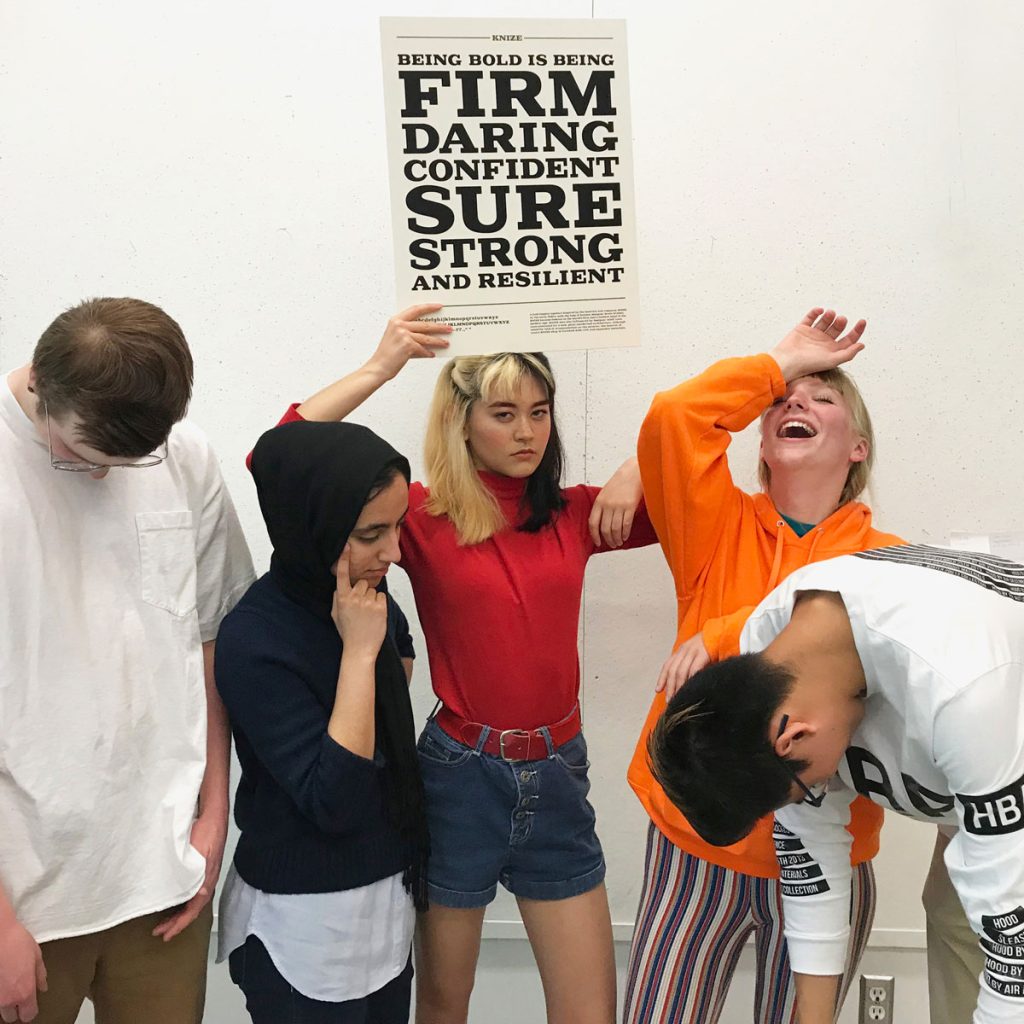
UW Design students from the class of 2020 Calvin Kordel, Raziah Ahmad, Koko Morrill, Eliza Townsend and Ian Yu show off a poster design created in design professor Karen Cheng’s typeface design course.
A designer must enjoy how letters sit against each other and make shapes within a larger system. “Typefaces look bad if they’re arbitrary,” Cheng says. “They can’t support too many features, or it becomes distracting. You have to put letters together to see how they’re shaping up. To quote the American type designer Matthew Carter, ‘A typeface isn’t a group of beautiful letters but a beautiful group of letters.’”